Posted by Joanna Lynch on November 1, 2017
The Federal Communications Commission (FCC) agency in the US uses a “spectrum screen” to review secondary market transactions. The screen acts as a benchmark to determine reasonable levels of spectrum holdings, and is used to assess mergers, spectrum swaps, or other similar transactions. For example, in the 600 MHz auction earlier this year, a portion of the new band was reserved for bidders who had less than 45 MHz of spectrum below 1 GHz, as determined by the spectrum screen.
 But have you ever wondered what frequency bands are included in the FCC spectrum screen? And how those bands are decided upon? I myself was curious and decided to put on my detective hat to investigate.
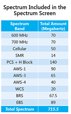
Since June 2014, the FCC has employed a one-third criterion in all frequency bands suitable for mobile broadband deployment. This means that an FCC review is triggered if a proposed transaction results in ownership of more than one-third of the total spectrum in any market. The bands that the FCC includes in its spectrum screen are 600 MHz, 700 MHz, 14 MHz of SMR, Cellular, PCS, AWS, WCS, and 156.5 MHz of the BRS/EBS band. There is also an enhanced screen below 1 GHz due to the value of low band spectrum.
What happens if a swap or merger exceeds the spectrum screen? Basically, it means that the FCC will take a closer look at those markets or counties to decide if the excess spectrum should be divested in the interest of allowing sufficient mobile competition. This means previously occupied and deployed spectrum may become available to other companies.

Because the spectrumscape of wireless holdings can be so complex, due to partitioning and frequency disaggregation, and because spectrum ownership frequently changes hands over time, trying to predict how this would affect certain markets can be pretty challenging.
This is where my investigation skills get some helpful assistance. I turn to our trusted data analytics tool, Comsearch’s Spectrum Atlas, to determine which markets might be affected. Spectrum Atlas makes it easy for anyone to quickly figure out the full picture. Interactive charts are sorted at the county, market or nationwide level by their aggregate spectrum totals. A clickable online map shows counties in the United States color-coded by total MHz per carrier. You can even adjust the map to display leases, pending spectrum acquisitions or specific blocks of interest.
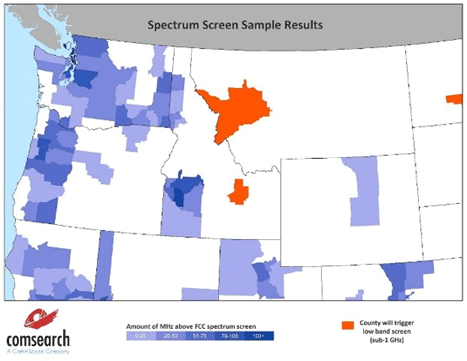
In the below example, I selected two licensees in the northwest region of the United States so that their spectrum holdings were combined. Looking at the charts and maps in Spectrum Atlas, it was easy to see that about one-third of their combined counties would potentially trigger a spectrum screen. Only a handful of those counties would exceed the trigger below 1 GHz, which is looked at more closely by the FCC. Regardless of the numbers, the FCC looks at all transactions on a case-by-case basis, and the FCC has the authority to approve any transaction in the public interest, even if it triggers the spectrum screen.

I plan to use Spectrum Atlas to analyze more possible scenarios. Are there any spectrum transactions that you think would be interesting to analyze?
About the Author
Joanna Lynch
 Joanna Lynch is the manager of data solutions at Comsearch. Joanna has more than 15 years of spectrum management and wireless engineering experience with a background as a design engineer working with PCS, cellular and satellite systems. In addition, she has spent seven+ years advising on wind energy obstruction and interference issues. Joanna earned her BSEE, with an Honor’s Citation, from the University of Maryland at College Park. She is an active member of the Institute of Electrical and Electronics Engineers, American Society for Healthcare Engineering and Eta Kappa Nu, the Electrical Engineering Honor Society.
